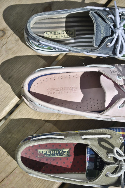
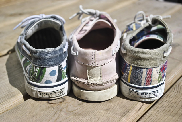
Concept: These two pictures are used together as an advertisement for Sperry Top-Sider shoes. My idea behind this photograph, besides the fact that my apartment is overflowing with this brand of shoe, was to create an ad that wreaks of summer. These shoes are made for boats and docks, which to me, IS my summer. I wanted to capture the essence of the brand in these pictures Composition: In the top photograph, I wanted to capture the whole shoe by putting emphasis on the back heel which reads "Sperry Top-Sider." I think my focusing on the text, it attracts the eye to the image and makes it clear what this photo is for. In the second photograph, I wanted to capture the fun designs on the inside of the shoe and highlight the differences each shoe has. In this photograph, I adjusted the frame so that the shoe was located on the right, emphasising the inside on the shoe. Method: Originally I had taken photos while the shoes were on my living room carpet. After I started to edit some of them, I realized the carpet was a not doing justice for the shoes and so I switched my backdrop by using the wooden planks instead. I took the pictures in mid-day light so the shoes were fully illuminated with sunlight.
"Pure Michigan Story"
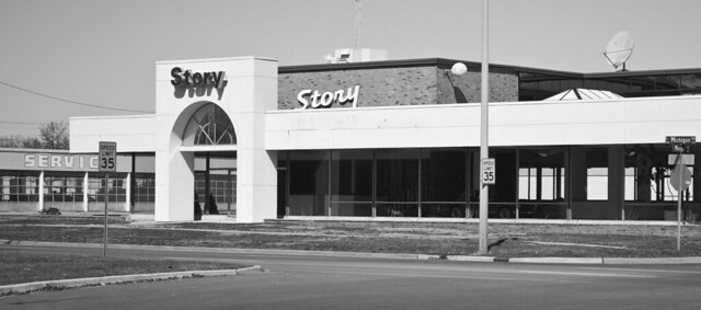 Concept: I hope it is clear what this picture is trying to represent... The death of Michigan's once-leading industry, the auto industry. I wanted to make an ironic representation of the state of Michigan. Composition: I chose to take the picture from this angle because it shows the emptiness of the building, as though it was deserted or abandoned. I altered it to make it black and white to make it look stark, lonely, sad yet old-fashioned. I felt that the "Story" on the building was ironic, as though it tells the "story" of Michigan, so I decided not to edit it out. Context: This is supposed to be a "postcard" or "poster child" which ironically but truthfully captures the state of Michigan right now. Unlike the advertisements which optimistically advertise "Pure Michigan," I feel that this picture better represents the state. Optimism may be warm and fuzzy but not always truthful.
 "Expose on the Exposed"
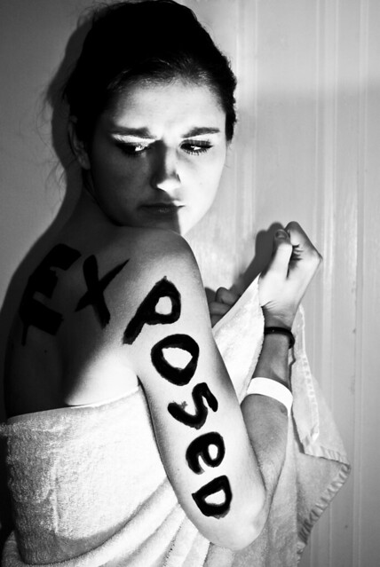
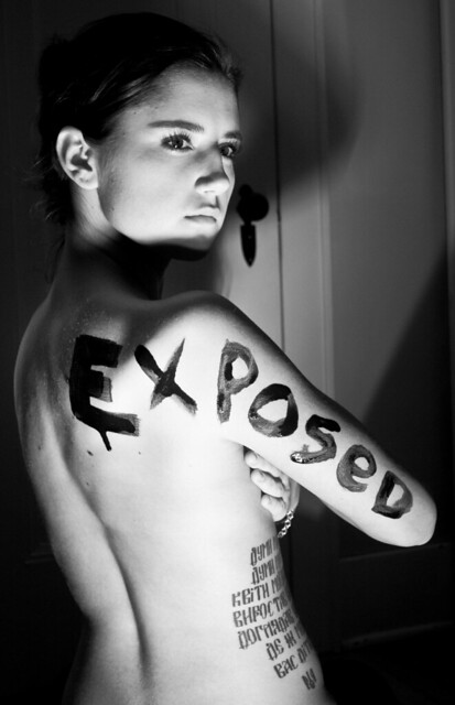
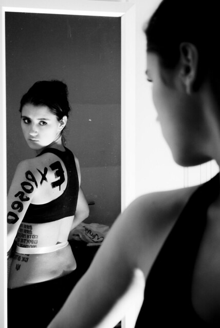
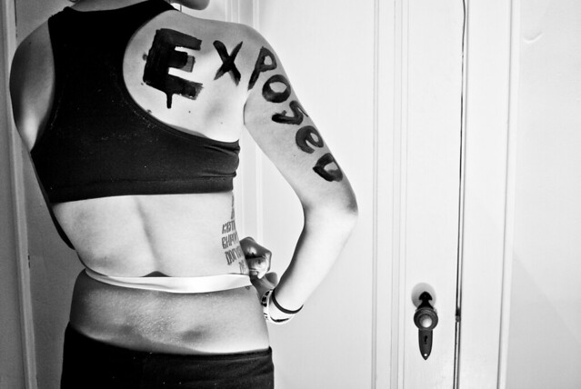
Concept: I feel sometimes that I may be media's biggest critic. Whenever I see a photograph in an advertisement I somehow always tend to look at it negatively, as though it's trying to expose, degrade, objectify the models. I feel advertisements, especially fashion advertisements, tend to "expose" women in a sexual way, by making the models wear minimal clothes and placing them in suggestive positions. I feel that these ad's also "expose" the insecurities, doubts, and self-consciousness which viewers of these ad's feel. I needed to make a blunt commentary on this. Composition: All the photos are black and white. She is located to either side of the frame so that the emphasis was placed on her contours, her face, and not simply her body. I used heavy contrast on all the photos to make them appear over-exposed. Method: I used my friend Lisa as my model. She was perfect for this photo shoot. She has an innocent face and a large tattoo which Sarah said looks like a branding. I used intense lighting to over-expose places on her body and to tie into the "expose theme." I painted her with black paint and used a mini spotlight as my light source. In some of the photo's I had to photoshop a door out of them, and to my surprise, they look like the door was never there!
No comments:
Post a Comment