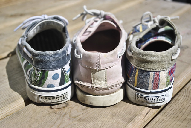
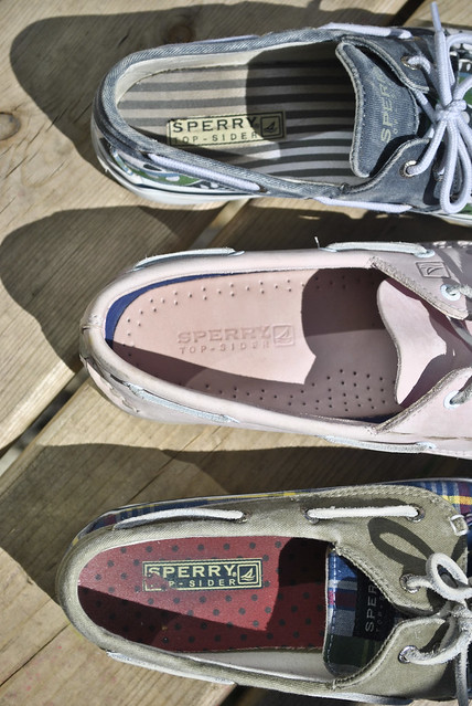
 The commercialism of the photographs in my "Sperry" shoe advertisements is simple. There is little room for interpretation. The shoes are photographed in a visually appealing setting in attempts to persuade viewers to buy the shoes. During the class critique, many said that they liked the tones and colors in the shoes photographs. My favorite aspect of this series is the sense of casual simplicity while maintaining a fun and colorful essence. Changes I would make to this series would be to take pictures of the shoes actually on a foot, instead of lying around. That would make the shoe appear more wearable. I could use this series of commercial photographs by creating a series that shows the details and colors which are so vital to the advertisement and fashion industry. "Pure Michigan Story"
 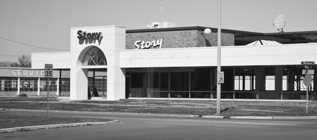 Many classmates interpreted this photograph exactly as a hoped; as an ironic yet blatantly true capture of the current state of Michigan. During the critique, some classmates said they liked the iron of the postcard but adding text to the bottom would have balanced the postcard better. Another classmate stated that it would improve the photograph by using colorful text instead of black to further stress the irony and sad truth of the postcard. If I were to go back and retake this picture, I would definitely try to create a more aesthetic picture instead of simply capturing a building from the side of the road. I could use this postcard a series of postcards which represent the sometimes sad and sometimes optimistic state of Michigan. "Expose on the Exposed"
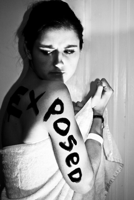
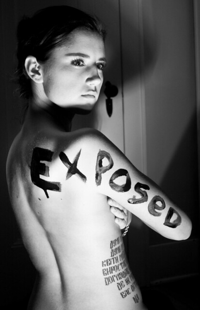
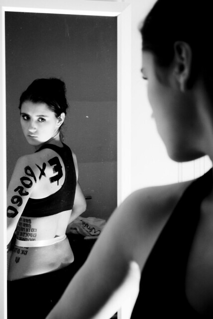
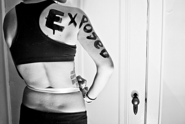 Interpretations of these photographs included the presence of insecurity in young women forced on by the media. Others included the crude exposure of models in fashion. Both are exactly what I was aiming for. Suggestions for my photographs included increasing the contrast in each photograph and emphasis the "over-exposure" of the subject. Another classmate suggested toning down the white background in some of the pictures and instead exposing her body more. Some classmates said they liked how the posed was highlighted instead of exposed in one of the photographs, and another student liked the organization of the set. Another student said they would like to see more facial expression in the subject. If I could change these photographs, I would have taken more pictures from more angles, instead of just her body and face. I could use this series as an inspiration to create other photographs which incorporate text on the body.
No comments:
Post a Comment