Saturday, April 30, 2011

Final Project: Textured Dispostion

A Projection of Personal Personalities. Exposing the Raw, Blunt, Casted Spirits.

Alycia
Alycia

Amy
Amy

Sara
Sara

Lauren
Lauren

Brenda
Brenda

Greg
Gregory

Kate- Self Portrait
Kate

The concept behind my project was to juxtapose true personalities- the ones within and the ones which others sees- with the false personalities- the ones people try to project onto others. I told my subjects to pose in whatever position they wanted to, and then I proceeded to layers textures, objects, and images on top of their portraits. The end result, a textured, simplified, rectangular disposition of those who are dear to my heart.

Friday, April 22, 2011

Blog Promptt #26

Brainstorms! (In an effort to expand, improve, add complexity, and push your final projects further, please pick 10 of the following to discuss.)

1. Ideas sometimes grow out of irritation. What is a negative thought you are having about your project? What is the opposite of this negative thought? How could you implement a change in your project so that this negative thought will subside?

Some negative thoughts are that my project may appear too simple. My idea is that I will layer two images on top of each other, but my fear is that this will appear too simple seeing as I will not be taking advantage of the program 
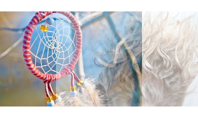
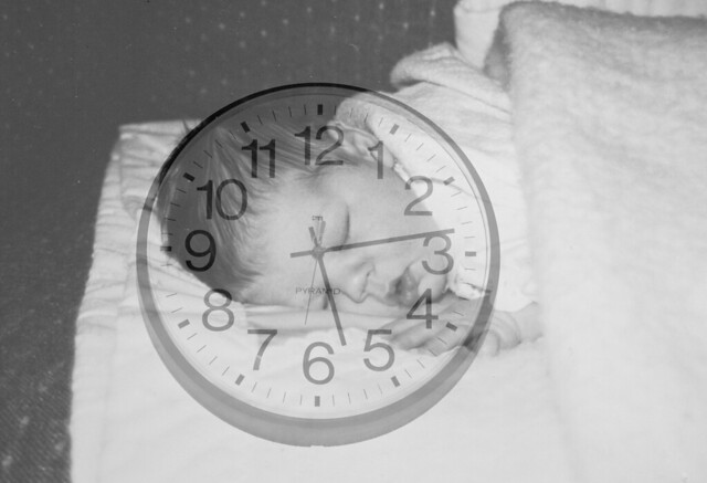
Photoshop. Opposite this thought is that I add more elements to my final photographs. I could possibly add several layers on top of the original portrait photograph; maybe a painting, a landscape, or abstract shape.

3. What is a consistent theme/visual element in your project? What would be the opposite of this? How can you implement that into your project?

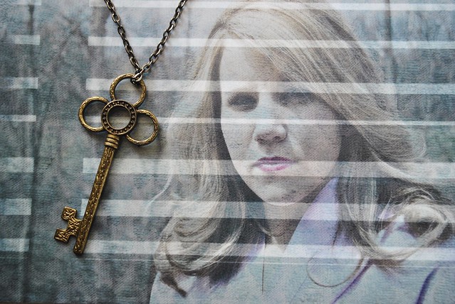
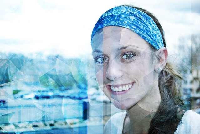
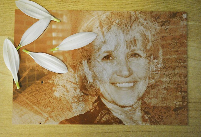
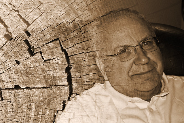
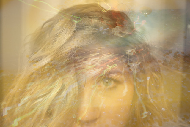
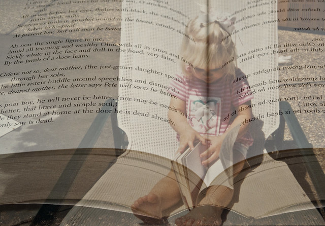
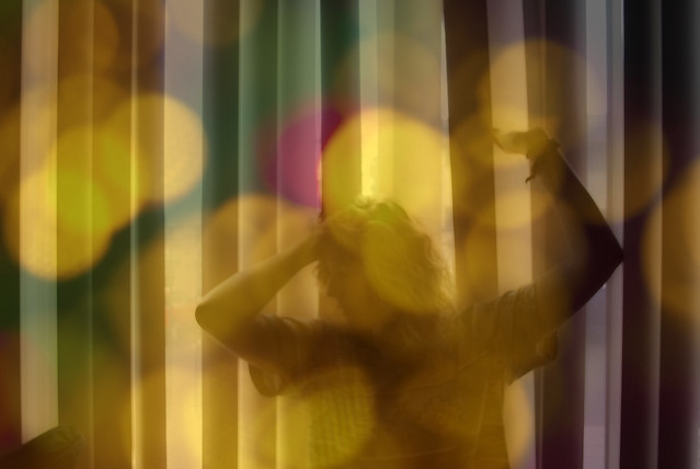
A constant theme in my project is the definition of personality and character. My thought process throughout this project is to take a portrait or a person (which will represent how THEY try to portray themselves) and then I will add layers on top of the portrait (which will represent how I think their personality is truly portrayed). Opposite this theme could be the lack of personality- or what people would look like if they had opposite personalities. I could implement this into my final project by distorting my subjects by making them appear to have opposite personalities from their own.

4. Type twenty words or phrases that relate to your project.

Clean, simple, blunt, direct, vibrant, full of personality, or the distortion of personality, the portrayal of personality, multiple personalities, true character, false character, telling, revealing, honest, straightforward, potentially conflicting, deeper meaning, or hidden meaning, how we want to appear to others, how we actually do appear to others.

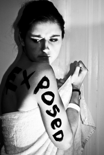
5. At the deepest core, describe why you like this project. Dig deep!
I really like this project because [when I was working on my last project] I really like how this type of picture- laying two or more pictures on top of each other/ blending images together) looked aesthetically. In addition, I think the idea is really captivating. We, as humans, try our hardest to project a personality that sometimes is not read by the audience in the same way. I think that representing a personality with a color, texture or photograph, will really help define what it means to project a personality.
6. Expand your project. If time, money, materials, etc would not affect you, how would you expand your project?

I would buy a canvas and paints and create a personalized, handmade painting of all my friends/family's "abstract personalities."

8.Look at one of your images. Redesign it entirely.


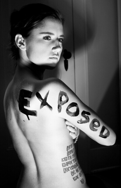
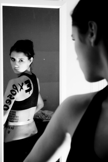
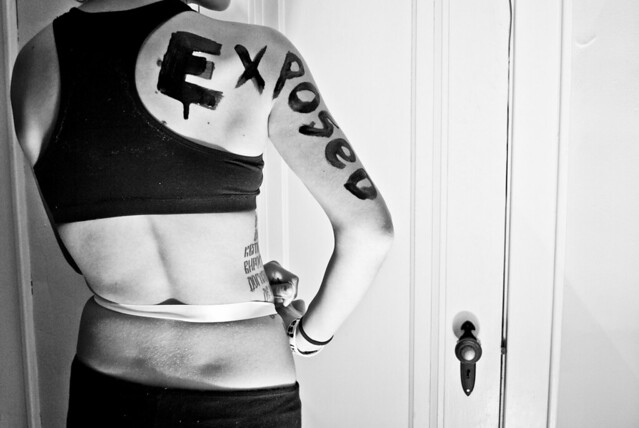
One of my images [of my friend Lauren] is supposed to represent her hot and cold personality. Whether she realizes it or not, it is her personality. I would take it and instead of doing a half and half photograph, with two different textures, I would cut up her face into 20-or-so slices and color them differently. This would represent her spontaneous moods and behaviors.

13. Persuade the reader that your project works well and is the most amazing project you have ever completed.


This project is unique because it's not everyday that a friend is willing to be blunt enough to tell you exactly what they think your personality is. This project is going to be aesthetically appealing, vibrant, and multifaceted.


14. Persuade the reader that your project stinks. Then, persuade the reader that you will make changes so that it no longer stinks.


The project appears to be too simple. It looks like I slacked off and didn't spend my time making it. However, if I add more layers to the photograph I can make it look more complex and add more meaning to the photograph.


15. Think of one of your most memorable dreams. How could you add elements from this dreams to your project?


One of my most memorable dreams involved a room full of people from my past, people who I've had issues with or conflict with, and in a dimly-lit room we solved all of our issues. By exposing my problems with people and subconsciously solving them in my dreams, it really helped me to solve the problems in reality. I could use this element by subtly and unconsciously exposing my subjects personality so they can have insight into how they are really seen by the public and those close to them.

21. How would you make your project more edgy, saccharine, provocative, empty, revealing, concealing, funny, sad, mysterious, blunt, honest, disingenuous, fast, slow, playful, austere, hateful, lovable, bold, subtle, long, short, big, small, connected, disconnected?


I could make my project more revealing by making the [intended] personality shine through. I will do this by layering not only just colors that represent the subjects personality, but maybe also a photograph that distinctly describes their personality (such as an object).

Tuesday, April 12, 2011

Assignment 5 Part 1 and 2 Written Statement

SET 1: Daydreams Open My Eyes

skyeye
AWAKE
dreamcatch
This series of photographs are my attempt to capture my dreams, which I obsess over, and make them visable, give them physical form. I constructed these photographs by overlaying two photographs. I wanted to use light and dream-like colors to make the photographs appear "cloud-like". I like how these pictures turned out. The textures that I layered on top of the portrait photographs (clouds in the sky/ glitter) really added to the seperate emotion in each picture. I really like the color in the photograph of the dreamcatcher and the hair.

Students liked how I combined the two photographs of my face and said it gave room for multiple interpretations. Others liked the framing and the colors I chose, and that the 3 images make a flowing composition. I think that the tones and low contrast work well in all of these photos; it gives them an airy, cloud-like feel. I wish I would have done more photos like this, and that is my only criticism. A jumping-off point from this project is actually what I am going to do for my final project :)


SET 2: Cracks in That Sidewalk

Drugs

There is no deeper layer to the saying in this photograph; it was merely graffiti on the sidewalk. However, I feel that the saying says something about out culture. The fact that it was placed on a sidewalk with hundreds of deep and dark cracks in it really illustrates the way that each of us are broken individuals, reaching our branches out for deeper meaning in life. That is why I chose to overlay the tree, that looks as though it is reaching towards something, on top of the graffitied sidewalk.

One student said that the tree reminded them of human veins that are a part of drug use. Classmates like how the cracks flow into the tree but would have liked to see the cement darkened. I would improve this photograph by making the sign brighter and the cement darker so that the saying would stick out more. A jumping-off point would be to take pictures of graffiti around town and manipulate the photograph so they have a deeper meaning.

SET 3: The Innocence of Time

Sleeptime
literate

This set of photographs have deep personal meaning for me. When I look at photographs from my childhood, I get this deep sense of guilt, as though I have changed as a person- as though my innoncence has been taken away- as though I have been tainted. I tried to make these pictures looks creepy even with the innoncence of the portrait present. That is why I chose to make the baby sleeping with the clock on top black and white. This photograph represents the short time it takes to wake up from that sleep and mature (with time) into someone completely disparete from the innocent sleeping child. The picture of me reading illustrates the two sides of a page- one right side, the other backwards- which represent the past and the present- who we once were as child and who we know have become. I took these pictures by photographing old childhood pictures and then overlaying a picture of a book which I mirrors horizontally and then a picture of a clock on the wall. I really like how each of them turned out.

Classmates really like the opacity of the layered photographs. I think what is working in the photograph of the little girl reading is the line that splits her head directly in the center. Students said that they wished I would have focused on a specific line in the book to give the photograph more meaning, however I like to leave the literature up to interpretation. The interpretation of the sleeping baby was that time passes quickly. I could improve these photographs by maybe adding another element, such as a color overlay, but in general I really like how these turned out. A jumping off point from this series would be to take pictures of others childhood photographs and distort them ever-so slightly so that they have a personal meaning to them.

SET 4: Interpretate that Dance

Dream2

I feel that this photograph is very fun and energetic. I took this picture by setting up a tripod, taking a picture of myself in front of the blinds with the sun coming through, and then overlayed a picture of out-of-focus glitter on top. I really like the tones in this photograph and the expression on the face- how the face is lightened up by the bright sparkle on top.

What is working in this photograph is how I look like (as a student said) "dancing in a neon sign," and gives the tone of a "metro city." Classmates liked the body position, the movement, and the life of the photograph. Another student said "the yellows and hints of other color seems to portray a joyfulness that is multifaceted. The wavy hair adds a touch of femininity." I would improve this photograph by maybe adding more saturation to bring out the bright colors of the overlay. A jumping off point from this photograph would be to do a series of movement photographs accompanied by an overlay which helps to enforce the movement.

SET 5: Red Rock n' Roll

red

I sadly didn't print this picture when we critiqued then in class- I definitely planned on printing them. I collected several objects from my friends room that would respond to the theme "rock n' roll" and other vices. I wanted to make this sort of collaboration to break up and distort the idea of rock n'roll- to show the pieces and fragments of this lifestyle which many strive to live. I feel that this photograph oozes with a rebellious, drunken, almost sinister feel. I unintentionally placed the objects ontop of this red sheet, but I really like how it adds to the tones and emotion of the picture. I also darkened the edges and added a vignette.

I didn't print this picture (on accident) and I am really upset about it. I really liked how it turned out when I manipulated it on photoshop. Since no one else saw it, there are no interpretations on it, but in general I really like the tones and choppiness of the picture, but maybe would have added more photographs to it to create a richer texture. A jumping off point from this picture would be to assemble other chaotic scenes and make more compositions.

SET 6: Glitter I's

030
020
014
002

This series was originally for the constructed recreation but I really enjoyed how they turned out and decided to add them to my final assignment 5 photographs that I printed. These photographs as a series represents the variety of interpretations which each of our eyes see when we look at works of art- or really life in general. Each eye can interperate that same scene differently and that is what makes each human a beautiful and unique individual. We are always working to find deeper meaning and significance in life. These photographs represent that chaos yet beauty with the need to always find meaning in things. I created these photographs by taking a picture of my friends eye and then covering the printed picture with glitter and sequins. I love the vibrance and clarity in these pictures.

What is working well in this series of photographs is how they are a really unique illusion. Students thought these photographs were alluring and creative but they wished I would have printed them larger to appreciate the little details better. I would definitely agree with that statement. When I printed these pictures, they came out horribly because the printer used a different type of paper which shrank the images. I really wish they would have turned out larger because the color and details in them were so great. A jumping off point from this series would be to manipulate other parts of the body, such as ears and the mouth, and make them more of a visual illusion.

Monday, April 11, 2011

Blog Prompt #25

You as Curator:
Look through the list of recent entrants to this call for photography.
[http://pdncuratorawards.com/entries.shtml]
Pretend you are curating a show and choose 7 photographers to include in your show. Describe why you would pick those particular artists and what about their work stands out to you.


Matt Dixon: He creates paint-like textures simply by taking pictures of rotting buildings or walls. The photographs are compelling and make you wonder where exactly this texture originates from.

Albert C Karges: I would pick this photographer because of his simple perspectives of nature. All his photographs emphasize the natural, simple beautiful of nature. I love his focal point and the straight horizons in every photograph. Also, the colors are very calming. It draws attention back to the natural aspects of nature and not the man-made, highly exoticized parts of nature.

Ljubodrag Andric: This series of photographs on the beach capture an innocent and carefree spirit. I want to jump in the photographs and enjoy the warmth of summer. The use of lighting and the sometimes curious object placement makes the photographs quirky while playful.

Ross White: Although he only has one photograph entered, I think this lonely photograph is hilarious. There is a guy reading a newspaper on a beach completely alone but surrounded by a mess of organized beach chairs. It's as though he is not alone because he has the company of all these inanimate objects around him. It comments on humans reliance on objects and comfort in inanimate objects. I also really enjoy the colors in this photograph.

Justin Borsuk: Justin's photographs are chaotic, colorful, playful, and romantic. His scenes of amusement parks and downtown nightlife make me dizzy but make me want to join in on the festivity. I love his use of colors and the layering of the photographs give them deep texture.

Erik Sumption: I applaud Erik Sumption for his ability to find color in any habitat. The majority of his pictures are abstract but all pull the eye in with his vibrant use of color.

Sunday, April 3, 2011

Blog Prompt #24

A. Pick two images from any of the “constructed reality” photographers presented in class or linked on the assignment sheet. Describe how you could recreate these two images on a “smaller scale”. #1: Abelardo Morell, View of Landscape Outside of Florence in Room with Bookcase

The idea is simple simple, but the pictures are all gorgeously surreal. It has the power of merging two distant places into one. It brings back the history of photography; bringing the places you are unable to reach into your living room by looking at a picture. The photographer of this series actually took the idea "into your living room" seriously.

I would recreate a "smaller" version of this series by either projecting or layering photographs from childhood locations (such as cottages, old houses, landscapes which were meaningful to me as a child) on top of my current living environment.


#2: Vik Muniz, Thread.
I think the work by Vik Muniz is incredible. I love the fact that he can create completely new scenes by using one, monotone object such as thread. It's haunting but so inventive. I would recreate this idea by forming portraits with thread on pavement. I will use color on the black cement and plain concrete. It will combine the unanimated character of thread with the animated spirit of human personality. I love the texture of Muniz's photos, so I would inject that idea into my photos by layering the colored thread to appear like real human hair. B. Describe your plans for your self-proposed final project (if the plan is the same as before, paste it here again and give a bit more detail). During the final critique for Assignment #5, you will discuss/present these ideas to the class.

My idea for my final project will be a play-off of the portrait project and the constructed reality project. I really enjoyed taking photographs and then physically altering them to create a fresh photograph with a deeper meaning. In my final project, I want to create a series of portraits and then take the personality of that subject and alter them accordingly. I want to burn pictures, rip them, add objects on top of them, paint them, and scratch into the photographs.


Wednesday, March 30, 2011

Historical Photographer


"It has never been my object to record my dreams, just the determination to realize them."
-Man Ray

Born as Emmanuel Radnitzky on August 27, 1980, in Pennsylvania, was an American photographer who contributed to the surrealist and Dada movements (a movement which commented on the what makes art have meaning). Most of his childhood went unrecorded but we do know that the Radnitzky family changed their name to Ray in order to avoid racial discrimination. Man Ray's mother was a great influence on his artistic abilities; during his childhood, his mother would create collage-like clothing designs using pieces of scrap material. His enrollment at the Ferrer School in 1912 was what propelled his artistic endeavors and developed his skills. He moved to Paris and worked with Cubism and began to develop his personal sense of style. During World War II He was forced to leave Europe and move back to New York. He died on November 18, 1976 due to a lung infection.

He worked with a lot of media art forms but he considered himself a painter. His speciality was working with photograms, an image made by exposing an object to light on top photo sensitive paper without the use of a camera, which he later coined "rayographs."He worked with fashion and portrait photography using avante-garde principles and also explore the film industry and written word.

His most famous works were using the famous performer Kiki of Montparnasse as his model, creating objects out her body.


Semi-Contemporary Photographer


"I think I am most fond of the unseen part. I mean that the various cultural experiences that I go through, and the behavioral aspects of getting the work done, are just as important as the installation and the photograph. So, for me, the relationship between the two is more about hybridism and the search for an ideal form that I'm never going to arrive at. The installation and the photograph are mere approximations of this ideal."
-Sandy Skoglund

Sandy Skoglund was born in Quincy, Massachusetts in 1946.
She attended Smith College and the University of Iowa and now teaches at Rutgers University

Skoglund began teaching herself photography in the 70's and started working as a "conceptual artist" in New York. She would take pictures to document her experiences and started working a lot with the art of repetition.

She is now recognized with her work with highly constructed scenes, which usually take months to create, that have the elements of repetition present. She will bring in her models the day of her shoot and then dismantle the set. She uses bright colors and exaggerated surreal environments. Her installations are used to "poke fun at suburban reality."


Recreation: Constructed Reality


Original Photograph: Teun Hocks, 187. Untitled, 2000

At first glance, this photograph is visually intriguing. Why in the world is this guy sticking his head through a painting? and more importantly, how? After reading some information on the photographer, this "photograph" was created by taking a picture and then painting over it to create this surreal-like image. It got me thinking... is this a commentary on how people interpret things? Do we try to dig so deeply into things, like art, literature, ideas, and try to grasp a meaning? Can anything have meaning? Can we make something out of any little speck of idea?

In my recreation, I wanted to capture the eye of the man. I want to see what he is looking at and how he is interpreting this painting which he is sticking his head inside. More importantly, how do we interpret this photograph which Hocks has created? In my recreation, I capture the iris, plain and simply, containing all the human flaws and details. I then splattered the photograph with diamonds and sparkles. Why? Because there is this form of visually aesthetic discomfort. Eyes should not look like this. Eyes should not be covered in sparkles and diamonds. I wanted to leave my picture up for interpretation. The eye is the source for what he visually understand and I wanted to distort this idea. We, as thinking human beings, attempt to grasp interpretation and meaning from almost every aspect of our lives. Our eyes hold all these ideas inside our pupils and brains. The second photograph I posted represents the explosion of collected meaning within our vision. I created a series of these photographs just to show how a simple and quick change in camera setting can so drastically change the meaning of the photograph, opening new doors to new ideas. Interpret these photographs however you like.


020 030

Assignment #4: Part 2 Written Statement

"Passion for the Sea" _DSC0146 _DSC0138 The commercialism of the photographs in my "Sperry" shoe advertisements is simple. There is little room for interpretation. The shoes are photographed in a visually appealing setting in attempts to persuade viewers to buy the shoes. During the class critique, many said that they liked the tones and colors in the shoes photographs. My favorite aspect of this series is the sense of casual simplicity while maintaining a fun and colorful essence. Changes I would make to this series would be to take pictures of the shoes actually on a foot, instead of lying around. That would make the shoe appear more wearable. I could use this series of commercial photographs by creating a series that shows the details and colors which are so vital to the advertisement and fashion industry. "Pure Michigan Story" Document Name2 Many classmates interpreted this photograph exactly as a hoped; as an ironic yet blatantly true capture of the current state of Michigan. During the critique, some classmates said they liked the iron of the postcard but adding text to the bottom would have balanced the postcard better. Another classmate stated that it would improve the photograph by using colorful text instead of black to further stress the irony and sad truth of the postcard. If I were to go back and retake this picture, I would definitely try to create a more aesthetic picture instead of simply capturing a building from the side of the road. I could use this postcard a series of postcards which represent the sometimes sad and sometimes optimistic state of Michigan. "Expose on the Exposed" Posed X-Posed DESOPXE Expoised Interpretations of these photographs included the presence of insecurity in young women forced on by the media. Others included the crude exposure of models in fashion. Both are exactly what I was aiming for. Suggestions for my photographs included increasing the contrast in each photograph and emphasis the "over-exposure" of the subject. Another classmate suggested toning down the white background in some of the pictures and instead exposing her body more. Some classmates said they liked how the posed was highlighted instead of exposed in one of the photographs, and another student liked the organization of the set. Another student said they would like to see more facial expression in the subject. If I could change these photographs, I would have taken more pictures from more angles, instead of just her body and face. I could use this series as an inspiration to create other photographs which incorporate text on the body.

Assignment #4: Final Written Statement

"A Passion For The Sea"

_DSC0138
_DSC0146


Concept: These two pictures are used together as an advertisement for Sperry Top-Sider shoes. My idea behind this photograph, besides the fact that my apartment is overflowing with this brand of shoe, was to create an ad that wreaks of summer. These shoes are made for boats and docks, which to me, IS my summer. I wanted to capture the essence of the brand in these pictures Composition: In the top photograph, I wanted to capture the whole shoe by putting emphasis on the back heel which reads "Sperry Top-Sider." I think my focusing on the text, it attracts the eye to the image and makes it clear what this photo is for. In the second photograph, I wanted to capture the fun designs on the inside of the shoe and highlight the differences each shoe has. In this photograph, I adjusted the frame so that the shoe was located on the right, emphasising the inside on the shoe. Method: Originally I had taken photos while the shoes were on my living room carpet. After I started to edit some of them, I realized the carpet was a not doing justice for the shoes and so I switched my backdrop by using the wooden planks instead. I took the pictures in mid-day light so the shoes were fully illuminated with sunlight.


"Pure Michigan Story" Document Name2 Concept: I hope it is clear what this picture is trying to represent... The death of Michigan's once-leading industry, the auto industry. I wanted to make an ironic representation of the state of Michigan. Composition: I chose to take the picture from this angle because it shows the emptiness of the building, as though it was deserted or abandoned. I altered it to make it black and white to make it look stark, lonely, sad yet old-fashioned. I felt that the "Story" on the building was ironic, as though it tells the "story" of Michigan, so I decided not to edit it out. Context: This is supposed to be a "postcard" or "poster child" which ironically but truthfully captures the state of Michigan right now. Unlike the advertisements which optimistically advertise "Pure Michigan," I feel that this picture better represents the state. Optimism may be warm and fuzzy but not always truthful.


"Expose on the Exposed"

Posed X-Posed
DESOPXE
Expoised


Concept: I feel sometimes that I may be media's biggest critic. Whenever I see a photograph in an advertisement I somehow always tend to look at it negatively, as though it's trying to expose, degrade, objectify the models. I feel advertisements, especially fashion advertisements, tend to "expose" women in a sexual way, by making the models wear minimal clothes and placing them in suggestive positions. I feel that these ad's also "expose" the insecurities, doubts, and self-consciousness which viewers of these ad's feel. I needed to make a blunt commentary on this. Composition: All the photos are black and white. She is located to either side of the frame so that the emphasis was placed on her contours, her face, and not simply her body. I used heavy contrast on all the photos to make them appear over-exposed. Method: I used my friend Lisa as my model. She was perfect for this photo shoot. She has an innocent face and a large tattoo which Sarah said looks like a branding. I used intense lighting to over-expose places on her body and to tie into the "expose theme." I painted her with black paint and used a mini spotlight as my light source. In some of the photo's I had to photoshop a door out of them, and to my surprise, they look like the door was never there!

Sunday, March 27, 2011

Blog Prompt #23

1. In what ways do you “construct” your identity?

In what ways do you “perform” in your daily life? We all, as humans, construct our identity through what we wear, how we talk, what we say, and what we do. We try to, sometimes unnaturally, create this persona that we must maintain in order to have our own individual identity. I, personally, tend to construct my identity though what I have to say and my actions towards others. I try to stay true to myself and my own formulated identity. We all should think before we talk and in a way that means we are performing; we are structuring our sentences and thoughts around those surrounding us. We may have multiple "personalities" which we swap out depending on who we are with (our family, friends, teachers, employers).


2. Describe some ways in which your personal culture and social environments are “constructed”

The culture which I live in is a highly commercialized and Americanized culture. The things I look at usually are forced in front of me (advertisements) and I have a narrow area for choice in what I take in with my senses. My social environments are constructed using these commercialized elements of mainstream culture, and then I create my own personal culture by reinterpreting the meaning of the popular culture.


3. Describe some ways in which your physical environment/space is “constructed”.

My physical environment is constructed by placing elements that I feel "scream Kate," such as the pillows I chose to put on my bed, and the posters I chose to hang on my wall. Little tokens of my life and my story are places in my personal spaces, especially my room, to remind myself of who exactly I am and where I came from. My room, both at home and at school, is flooded with pictures of my family and friends. In more public spaces, I don't have to control of the construction, so I am forced to find myself within the constructed space.


4. In your daily life, what would you consider to be “real” and what would you consider to be “constructed/fabricated”?

With my environment, I consider the rawnesss of nature to be real and man-made construction to be "fabricated". Emotions, such as happiness, fear and anxiety are real. Exaggerated expressions are fabricated in order to draw attention to ones self. Things constructed by men can be beautiful and dangerous; pollution is constructed but the education system is also constructed. Television is constructed, even those TV shows that claim to be "reality." Dreams are a creative form of reality.


5. Describe a narrative tableaux that you might create to be captured by a photograph. A narrative tableaux can be defined as “Several human actors play out scenes from everyday life, history, myth or the fantasy of the direction artist” ( Constructed Realities: The Art of Staged Photography Edited by Michael Kohler , 34).

I would create a narrative tableaux of a dream. Whenever I wake up from dreams they feel so real that I cannot differentiate reality from surreality. I would create a scene that comes directly from my mind so that I can visually explain the emotions, ideas, and scenes that occurred in my dream-world.


6. Describe an idea for a photograph that includes a miniature stage or still life. A description of such an image is “The tableaux reconstructs events as in the narrative tableaux, but in miniaturized format, using dolls and other toy objects” (Kohler, 34).

The picture below really inspires me. In a way, this photograph represents where I am in my life. To me, this photograph represents the strings that hold us down, attached to our limbs, but eventually are freed, flying to boundless heights. I would use this photograph as an inspiration by using a human subject, wrapping ropes or chains around their wrists, much like the picture below, and then using sticker/paper birds to represent the eventual freedom.