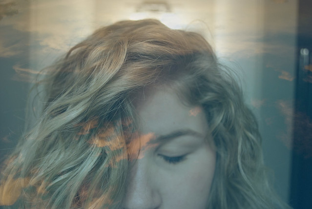
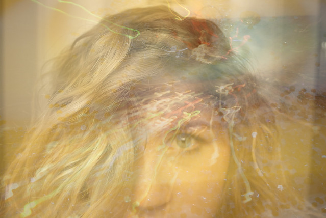
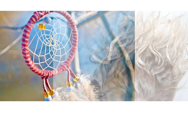
This series of photographs are my attempt to capture my dreams, which I obsess over, and make them visable, give them physical form. I constructed these photographs by overlaying two photographs. I wanted to use light and dream-like colors to make the photographs appear "cloud-like". I like how these pictures turned out. The textures that I layered on top of the portrait photographs (clouds in the sky/ glitter) really added to the seperate emotion in each picture. I really like the color in the photograph of the dreamcatcher and the hair.
Students liked how I combined the two photographs of my face and said it gave room for multiple interpretations. Others liked the framing and the colors I chose, and that the 3 images make a flowing composition. I think that the tones and low contrast work well in all of these photos; it gives them an airy, cloud-like feel. I wish I would have done more photos like this, and that is my only criticism. A jumping-off point from this project is actually what I am going to do for my final project :)
SET 2: Cracks in That Sidewalk
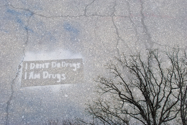
There is no deeper layer to the saying in this photograph; it was merely graffiti on the sidewalk. However, I feel that the saying says something about out culture. The fact that it was placed on a sidewalk with hundreds of deep and dark cracks in it really illustrates the way that each of us are broken individuals, reaching our branches out for deeper meaning in life. That is why I chose to overlay the tree, that looks as though it is reaching towards something, on top of the graffitied sidewalk.
One student said that the tree reminded them of human veins that are a part of drug use. Classmates like how the cracks flow into the tree but would have liked to see the cement darkened. I would improve this photograph by making the sign brighter and the cement darker so that the saying would stick out more. A jumping-off point would be to take pictures of graffiti around town and manipulate the photograph so they have a deeper meaning.
SET 3: The Innocence of Time
This set of photographs have deep personal meaning for me. When I look at photographs from my childhood, I get this deep sense of guilt, as though I have changed as a person- as though my innoncence has been taken away- as though I have been tainted. I tried to make these pictures looks creepy even with the innoncence of the portrait present. That is why I chose to make the baby sleeping with the clock on top black and white. This photograph represents the short time it takes to wake up from that sleep and mature (with time) into someone completely disparete from the innocent sleeping child. The picture of me reading illustrates the two sides of a page- one right side, the other backwards- which represent the past and the present- who we once were as child and who we know have become. I took these pictures by photographing old childhood pictures and then overlaying a picture of a book which I mirrors horizontally and then a picture of a clock on the wall. I really like how each of them turned out.
SET 2: Cracks in That Sidewalk
There is no deeper layer to the saying in this photograph; it was merely graffiti on the sidewalk. However, I feel that the saying says something about out culture. The fact that it was placed on a sidewalk with hundreds of deep and dark cracks in it really illustrates the way that each of us are broken individuals, reaching our branches out for deeper meaning in life. That is why I chose to overlay the tree, that looks as though it is reaching towards something, on top of the graffitied sidewalk.
One student said that the tree reminded them of human veins that are a part of drug use. Classmates like how the cracks flow into the tree but would have liked to see the cement darkened. I would improve this photograph by making the sign brighter and the cement darker so that the saying would stick out more. A jumping-off point would be to take pictures of graffiti around town and manipulate the photograph so they have a deeper meaning.
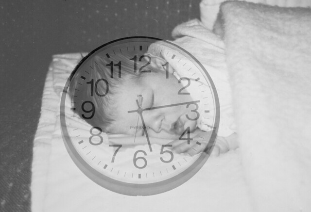
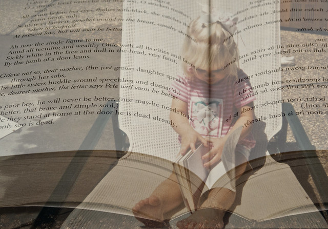
SET 3: The Innocence of Time
This set of photographs have deep personal meaning for me. When I look at photographs from my childhood, I get this deep sense of guilt, as though I have changed as a person- as though my innoncence has been taken away- as though I have been tainted. I tried to make these pictures looks creepy even with the innoncence of the portrait present. That is why I chose to make the baby sleeping with the clock on top black and white. This photograph represents the short time it takes to wake up from that sleep and mature (with time) into someone completely disparete from the innocent sleeping child. The picture of me reading illustrates the two sides of a page- one right side, the other backwards- which represent the past and the present- who we once were as child and who we know have become. I took these pictures by photographing old childhood pictures and then overlaying a picture of a book which I mirrors horizontally and then a picture of a clock on the wall. I really like how each of them turned out.
Classmates really like the opacity of the layered photographs. I think what is working in the photograph of the little girl reading is the line that splits her head directly in the center. Students said that they wished I would have focused on a specific line in the book to give the photograph more meaning, however I like to leave the literature up to interpretation. The interpretation of the sleeping baby was that time passes quickly. I could improve these photographs by maybe adding another element, such as a color overlay, but in general I really like how these turned out. A jumping off point from this series would be to take pictures of others childhood photographs and distort them ever-so slightly so that they have a personal meaning to them.
SET 4: Interpretate that Dance
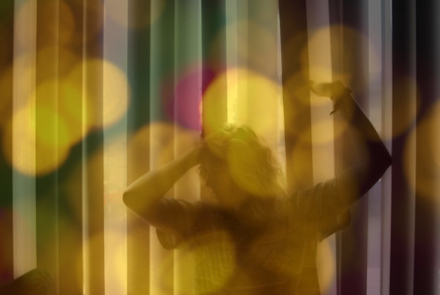
I feel that this photograph is very fun and energetic. I took this picture by setting up a tripod, taking a picture of myself in front of the blinds with the sun coming through, and then overlayed a picture of out-of-focus glitter on top. I really like the tones in this photograph and the expression on the face- how the face is lightened up by the bright sparkle on top.
SET 4: Interpretate that Dance
I feel that this photograph is very fun and energetic. I took this picture by setting up a tripod, taking a picture of myself in front of the blinds with the sun coming through, and then overlayed a picture of out-of-focus glitter on top. I really like the tones in this photograph and the expression on the face- how the face is lightened up by the bright sparkle on top.
What is working in this photograph is how I look like (as a student said) "dancing in a neon sign," and gives the tone of a "metro city." Classmates liked the body position, the movement, and the life of the photograph. Another student said "the yellows and hints of other color seems to portray a joyfulness that is multifaceted. The wavy hair adds a touch of femininity." I would improve this photograph by maybe adding more saturation to bring out the bright colors of the overlay. A jumping off point from this photograph would be to do a series of movement photographs accompanied by an overlay which helps to enforce the movement.
SET 5: Red Rock n' Roll
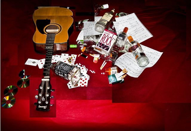
I sadly didn't print this picture when we critiqued then in class- I definitely planned on printing them. I collected several objects from my friends room that would respond to the theme "rock n' roll" and other vices. I wanted to make this sort of collaboration to break up and distort the idea of rock n'roll- to show the pieces and fragments of this lifestyle which many strive to live. I feel that this photograph oozes with a rebellious, drunken, almost sinister feel. I unintentionally placed the objects ontop of this red sheet, but I really like how it adds to the tones and emotion of the picture. I also darkened the edges and added a vignette.
SET 5: Red Rock n' Roll
I sadly didn't print this picture when we critiqued then in class- I definitely planned on printing them. I collected several objects from my friends room that would respond to the theme "rock n' roll" and other vices. I wanted to make this sort of collaboration to break up and distort the idea of rock n'roll- to show the pieces and fragments of this lifestyle which many strive to live. I feel that this photograph oozes with a rebellious, drunken, almost sinister feel. I unintentionally placed the objects ontop of this red sheet, but I really like how it adds to the tones and emotion of the picture. I also darkened the edges and added a vignette.
I didn't print this picture (on accident) and I am really upset about it. I really liked how it turned out when I manipulated it on photoshop. Since no one else saw it, there are no interpretations on it, but in general I really like the tones and choppiness of the picture, but maybe would have added more photographs to it to create a richer texture. A jumping off point from this picture would be to assemble other chaotic scenes and make more compositions.
SET 6: Glitter I's
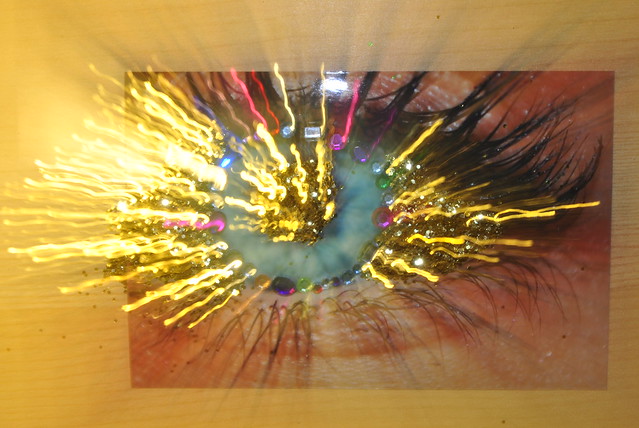
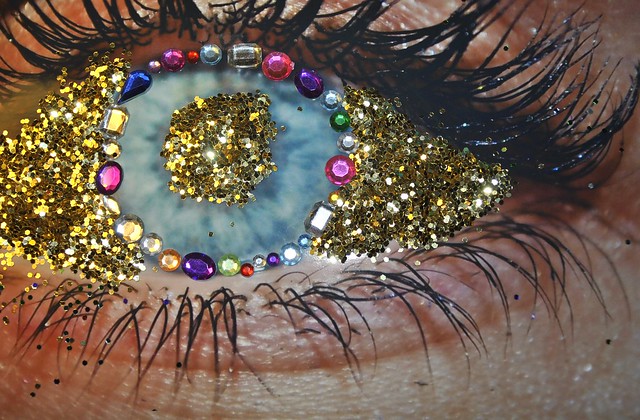
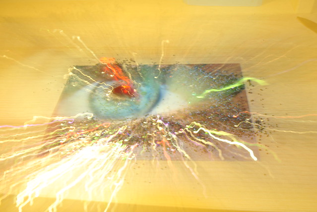
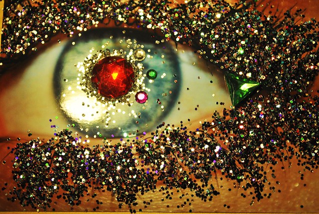
This series was originally for the constructed recreation but I really enjoyed how they turned out and decided to add them to my final assignment 5 photographs that I printed. These photographs as a series represents the variety of interpretations which each of our eyes see when we look at works of art- or really life in general. Each eye can interperate that same scene differently and that is what makes each human a beautiful and unique individual. We are always working to find deeper meaning and significance in life. These photographs represent that chaos yet beauty with the need to always find meaning in things. I created these photographs by taking a picture of my friends eye and then covering the printed picture with glitter and sequins. I love the vibrance and clarity in these pictures.
SET 6: Glitter I's
This series was originally for the constructed recreation but I really enjoyed how they turned out and decided to add them to my final assignment 5 photographs that I printed. These photographs as a series represents the variety of interpretations which each of our eyes see when we look at works of art- or really life in general. Each eye can interperate that same scene differently and that is what makes each human a beautiful and unique individual. We are always working to find deeper meaning and significance in life. These photographs represent that chaos yet beauty with the need to always find meaning in things. I created these photographs by taking a picture of my friends eye and then covering the printed picture with glitter and sequins. I love the vibrance and clarity in these pictures.
What is working well in this series of photographs is how they are a really unique illusion. Students thought these photographs were alluring and creative but they wished I would have printed them larger to appreciate the little details better. I would definitely agree with that statement. When I printed these pictures, they came out horribly because the printer used a different type of paper which shrank the images. I really wish they would have turned out larger because the color and details in them were so great. A jumping off point from this series would be to manipulate other parts of the body, such as ears and the mouth, and make them more of a visual illusion.
Diana Douglas
ReplyDeleteAll four of these images are really interesting. The second and fourth images are my favorites. The second image is so great. I love the work you did in photoshop with it and the concept overall works perfectly. The fourth image is also very interesting to me. I love the colors in it and it just has a feeling to it that I can't put in words, but absolutely love. The first and third image seem to go together, and I think they might be more successful if you created a series with more images that were similar to them. That's not to say that they aren't great images on their own, because they are. Overall, I think these are all very successful!
ReplyDeleteI like your use of multiple images for all of these photos. The girl reading, the second photo down, the third up from the bottom, and then the baby are my favorites. The mask is neat but would be better if you could bring out the background colors more.
ReplyDeleteI love the use of overlay in all of these images. You have to really look at each of them to appreciate them for what they are.
ReplyDeleteMy favorite is the dancer with the lights over it. The colors complement each other well and portray emotion. Good work!
I really enjoy the piecing together of the last two images. The second to last one however, is my favorite. The composition overall is just amazing. The colors, the framing, and perspective that you chose I think made this image extremely successful. My second favorite is the on of your hair that is overlayed over the blue sky. I really enjoy the waves that your hair creates in the sky. It is a very beautiful and peaceful image. I think you have done a great job!
ReplyDeleteI like the overlay style on all of these... Great job! The constructed face is really well done and seems to be able to capture a lot in just one picture.
ReplyDelete"I dont do drugs, I am drugs" is a great image with the tree - the composition is really creative. Black and white is a really good idea.
I really like all of these. I think that this type of image overlay is really interesting and your photos are beautiful. The baby and clock one is a really good idea and I think that there are many different interpretations of it. The colors in the second one are really pretty!
ReplyDeleteoh my gosh, these images! the photos with the little girl are SO haunting and really convey a story. I also love images 1, 3 and 6. Great work!
ReplyDelete